
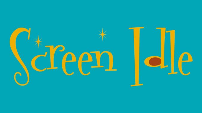
Screen Idle, a so-called ‘amusing film blog,’ has rebranded its website in what many are calling a transparent attempt to gain attention.
The rebrand appears to be largely just a few changes to the colours on the logo, but that hasn’t stopped blog-owner Neil Tollfree going on about it.
“It’s a subtle gold that evokes the great and glamorous Hollywood award ceremonies and an eye-catching blue that calls to mind the ocean on a Summer’s day,” he said, and then knacked on about brand-engagement and blog-retention until people in earshot started sticking pins in their own faces in a desperate attempt to alleviate the boredom.
Fans of the blog had mixed feelings about the rebrand.
“Yeah, it’s yellow. Whatever,” said a woman who’d accidentally subscribed to the newsletter and hadn’t got round to unsubscribing.
“Screen Idle? Is that them who did that thing about the James Bond film being cancelled last year? Are they still going? Blimey,” said a man who really wasn’t terribly interested.
What most people do agree on, though, is that the rebrand is just a way to get attention, and if Screen Idle ends up producing a self-deprecating and not-as-funny-as-it-thinks-it-is article about the fact that they’ve rebranded, then it’s just going to just come off as self-indulgent as well as attention-seeking.
So, well done.